Formatting Claris FileMaker Layouts is a Slippery Slope
Creating pixel-perfect Claris FileMaker layouts is hard. Keeping it pixel-perfect through all future releases is harder. I’ve spent tons of time carefully positioning every object to make the layout look perfect. Then, the moment I update the content of a label, or change the text orientation of a label-field pair, the perfection falls apart.
Do you know what the craziest part is about maintaining a pixel-perfect layout? Once you’ve let the layout slide consciously once, it’s done. You no longer care. It will never be perfect again. We all have many tasks to do, and we are all tired, and we all tend to forget a thing or two. This is perfectly normal.
What’s the best way to ensure we won’t let the layout slide? I’d say the best way is to minimize the maintenance work we have to do. The fewer and the less attention-demanding steps we need to take to maintain perfection, the less likely we are to let it slide.
So, in this article, I’d like to share a few basic but useful tips that will help you minimize the steps you need to create, and more importantly, to maintain a pixel-perfect layout, specifically with the most common layout pattern: a top-bottom, label-field pair.
1. Ensure Equal Text Alignment for Label & Field
With a top-bottom, label-field pair, as a rule of thumb, your label should be left-aligned if your field is left-aligned. If your field is right-aligned, your label should be right-aligned.
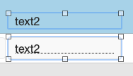
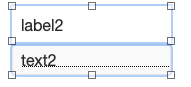
You don’t want to have your field left-aligned but the label right-aligned, and somehow meticulously position the label to make it look aligned with the field, as shown below. I keep seeing this in legacy apps.
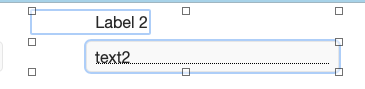
Don’t do this
If your alignment looks like the picture above, you’d have to reposition the label to realign the text when you update the label.
Simply changing the capital L to lowercase ruins everything
Keeping the text alignment the same saves you a lot of work when you need to make adjustments, especially when combined with the next tip.
2. Use Equal Width & Padding; Make Padding Symmetric
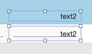
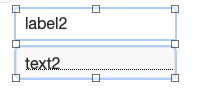
This is useful when you have a mixture of left and right-aligned fields, like in a list.
Giving your label and field the same paddings makes it easier to align their text content because now, as long as their edges align, their text will align (assuming you’ve adopted tip 1 as well, and there are no super thick borders).
Why give them the same width and symmetric padding? These two habits are useful when working with a list, whether in the List view or a portal. It’s common to have both left-aligned and right-aligned fields in a list.
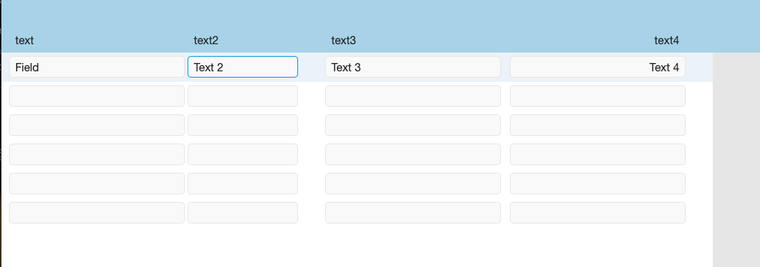
It’s common to have a list with both left and right-aligned fields
It’s very common for us to either copy one label-field pair to create multiple, or use the field selector on the left to drag and drop multiple fields onto the layout together. Regardless, your text will have the same alignment with these two methods.
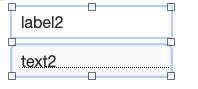
Say all your labels and fields are now left-aligned, but you want to update some of them to be right-aligned. If they already have the same width and symmetric padding, all you need to do is change their text alignment, and it’s done.
One action, change text alignment, done
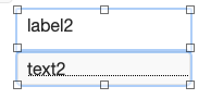
Otherwise, consider the following case (which is super common) where the label is shorter than the field, and the left padding is greater than 0, but the right padding is 0. In Browse mode, this looks identical to the scenario above. But to change this to be right-aligned, I’d have to:
- Update the text alignment to be right-aligned.
- Align the right edge of the label with the right edge of the field
- Add a right padding to both the label and field
To change this to right-aligned, we need to take three steps
As I mentioned at the beginning of the article, the fewer steps you need to take, the more likely you will maintain your pixel-perfect layout. So, one step is much better than three.
3. Avoid Center-Aligning Label or Field Vertically
The goal is to minimize text movement when we make a label or field bigger.
By default, many FileMaker themes use center alignment vertically for text and field objects. Change them to top-aligned unless you have a specific use case for center alignment.
When the object is center-aligned vertically, stretching the object taller will make the text move down.
For a label, since the label sits atop the field, making the label taller now changes its text relative position to the field’s text. And now you have one pair of them that look different than the others.
But if the label is top-aligned, stretching it doesn’t change how they look in Browse mode.
For a field, a top-aligned text field can serve both for entering one line of data (say a name) or multiple lines of data (say a description). All you need to do is stretch it taller, and it will keep its text-relative positioning with all other objects on a layout.
4. In Form View, Adjust Label Height to Touch Field
This tip builds on #3. One big challenge I’ve seen junior developers face is keeping the positioning between a label and field consistent across many pairs, either on the same layout or across multiple layouts.
Many developers do mental math when positioning these label-field pairs to keep them consistent. Or say it out loud: “The bottom of this label is at 576 pt. It’s supposed to be 4 pt above the field. So, the field’s top should be 580 pt. It’s currently at 578, so I’ll need to press the down arrow key twice…”
Have you done this? You know you’ve done this ![]() .
.
What’s the best alternative? Assuming you’ve taken tip 3, if you want to keep the vertical distance between the label text and the field text consistent across the board, all you need to do is find one pair and position them so they look correct, then adjust the label height until its bottom edge touches the top edge of the field.
Why does it need to touch? Because FileMaker has this awesome feature called Dynamic Guides. Dynamic Guides make getting the label’s bottom edge to touch a field’s top edge easy. You can do this via drag and drop without making precise pixel adjustments; they snap-fit together like magnets.
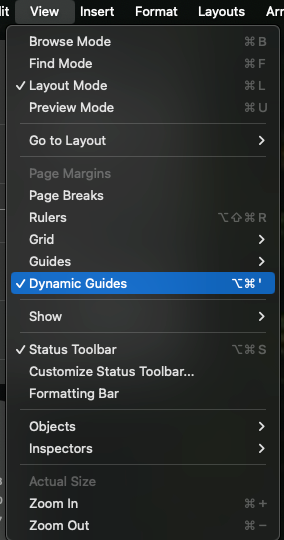
How to enable Dynamic Guides
If you have a bunch of label-field pairs and have one pair that looks correct and edge-touches, you can select all labels on the layout and give them the same height as the label in the first pair. After that, do the same for fields. Now, leveraging Dynamic Guides, it will be very easy to move these labels and fields to make them snap-fit together, or know if they are off when you accidentally move an object.
Conclusion
Work hard, but also work smart. Using the four tips above, we can minimize the steps we must take when building or maintaining label-field pairs on layouts.
Do you have a custom FileMaker solution that you are maintaining and want more tips like this to make your life easier? Contact us. We offer coaching and development services that will fit your needs one way or the other.
I hope you like this article. I’ll see you in the next one!